Welcome to the first of, hopefully, many case studies of my work produced under the Sam’s Design Productions brand!
Today’s focus for this case study is on a very special project which ended up spanning many months. This piece of work stemmed from the renowned Railway Family Prize Draw & Auction.
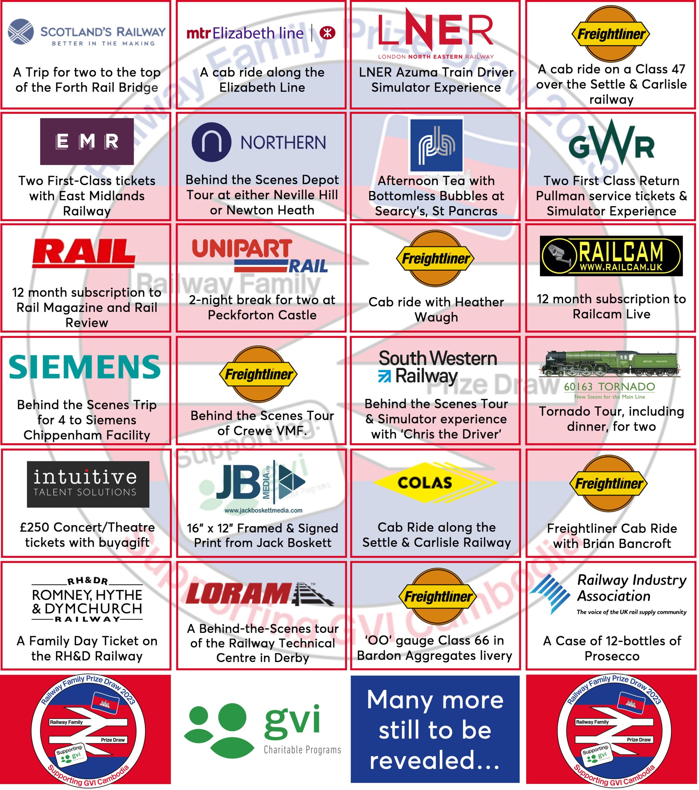
The Railway Family Prize Draw is an annual event organised by a legendary figure in the Railway Family, Heather Waugh, alongside several other individuals and companies who support the Prize Draw in many ways year after year. The draw is centred around companies and figures in the railway and related industries generously donating, typically ‘once in a lifetime’, prizes for the public to buy tickets for the draw and try their luck at winning a prize. The Prize Draw chooses a charity to support each year and to date has raised over £65,000 for many very deserving causes.
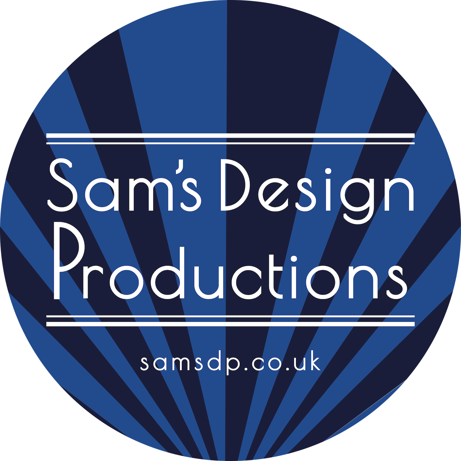
I have been involved with the Prize Draw for a couple of years now. Last year (2022) I designed their logo which for that particular year was in aid of the charity ‘British-Ukrainian Aid’ and was running in conjunction with Britain’s best-selling modern railway magazine ‘RAIL’. The charity was very topical given the ongoing war in Ukraine. My logo design was even published in one edition of the RAIL magazine which was the first time any of my work had been published in such a prestigious publication. The design work received much praise and began to form the iconic brand for the Prize Draw. My logo and branding were then used by, again a very well-respected and loved name in the Railway Family, Mike Roberts in other marketing material and related branded graphics/posters. Mike did a brilliant job at keeping my design in its true form whilst creating so many brilliant, iconic and unique graphics. I must thank Mike for his hard work in creating all the marketing material as I would not have had enough hours in the day to produce as many graphics as he did!

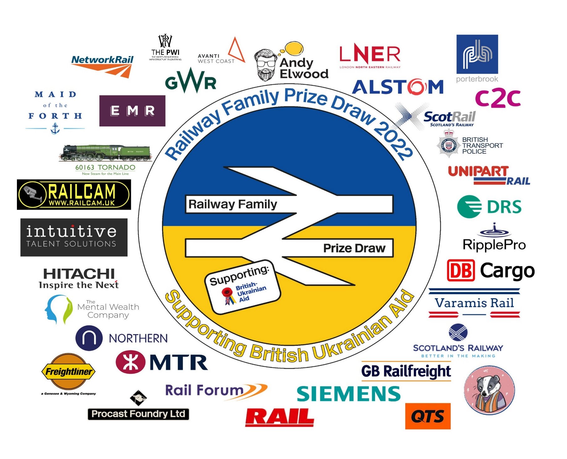
So, this year (2023), I was honoured when Heather approached me to design their logo for a second year. I, of course, said yes and that I would be delighted to lend a design hand once again. This year’s Prize Draw was raising money for another deserving cause, ‘GVI Charitable Programs’ to raise funds for the young people and children in Cambodia.
The 2023 ‘GVI Charitable Programs’ Prize Draw logo followed a similar identity to the 2022 ‘British-Ukrainian Aid’ Prize Draw logo with the focal point being on the colours of the Cambodian flag. The logo was once again taken by Mike Roberts and turned into a full identity with Mike creating all the various graphics and posts for the 2023 Prize Draw campaign.
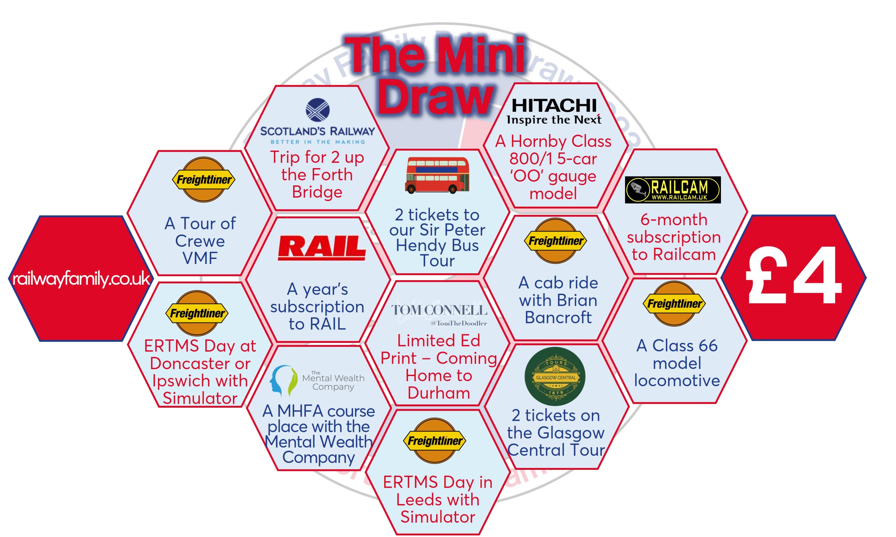
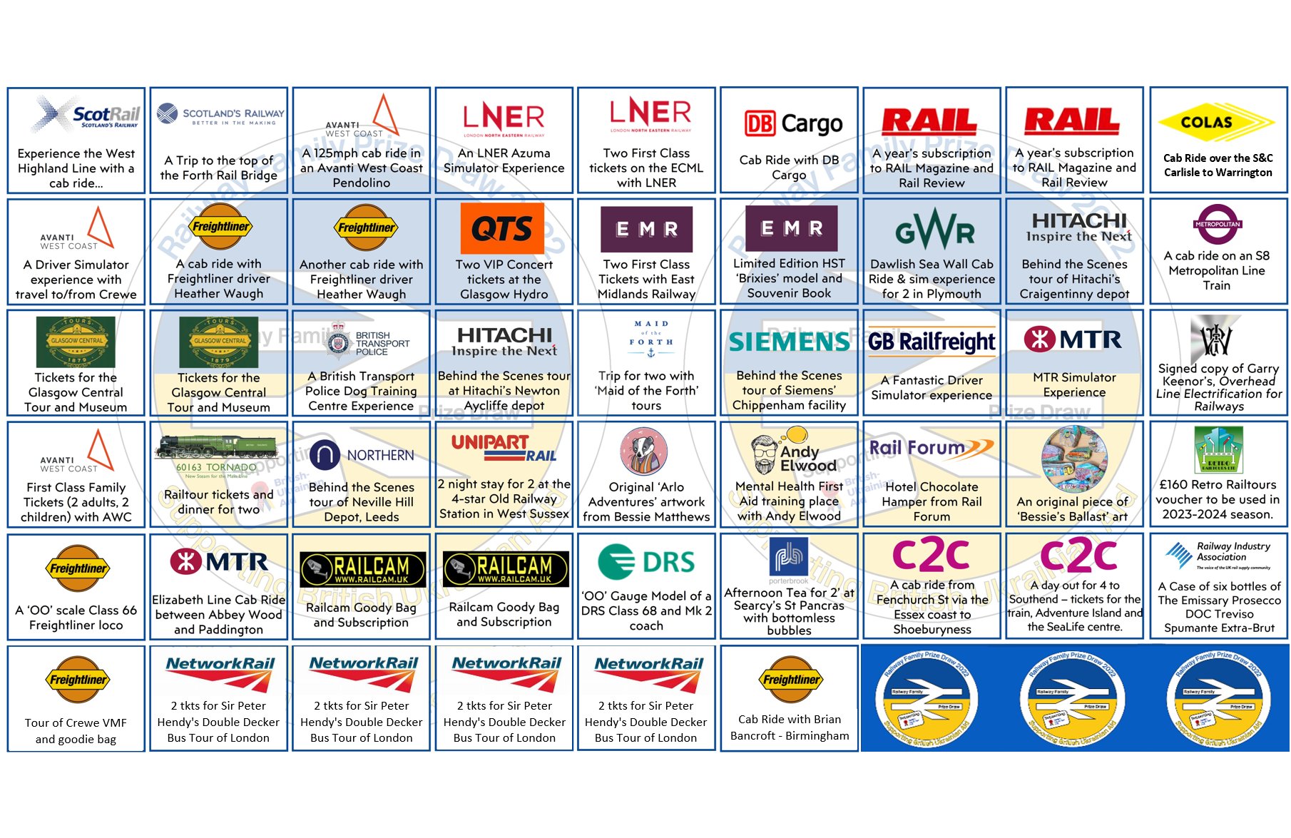
Mike’s Mini Prize List Graphic
The charitable partner for the 2023 Prize Draw was chosen after Heather travelled to Cambodia to volunteer in schools and saw the difference the money that the Prize Draw was likely to generate could make. No one could be sure how well the Prize Draw would be received this year given how topical the benefiting charity was last year, so it was a bit of a risk. However, it soon became clear that all the concerns were for little reason, as companies and figures in the rail and related industries donated dozens of ‘once in a lifetime’ prizes (over 50!). Given the number of prizes donated, people came in their hundreds, and for the first time ever the Main Draw sold out!
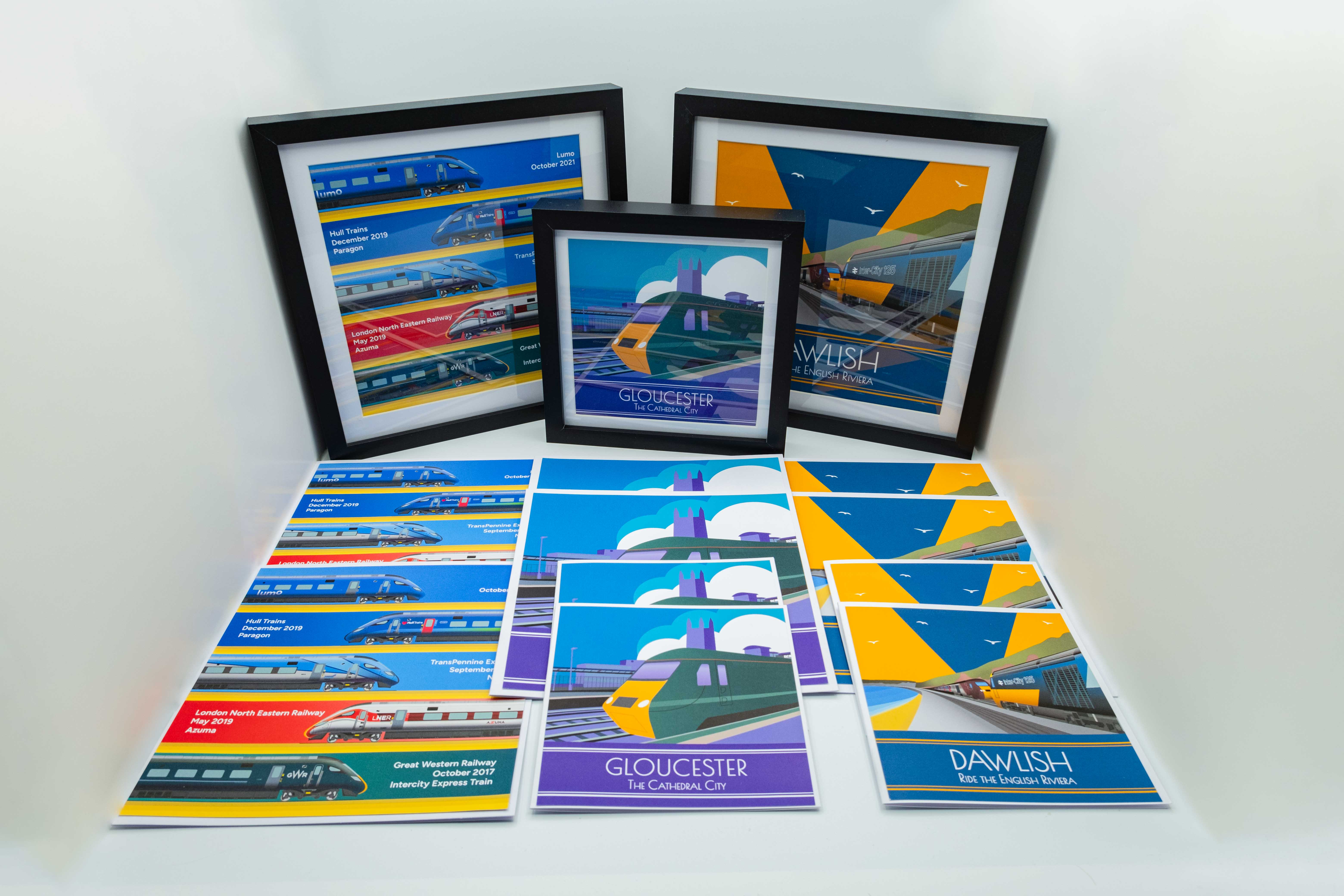
One of the prizes donated to the Prize Draw this year was donated by me! I wasn’t sure if my prize would be suitable as I couldn’t offer anything that was a ‘once in a lifetime’ type experience, but I could put my design experience and skills to further good use and produce a little bundle of cards and prints which might just make a nice little prize.
I pitched the idea to Heather, and she was more than happy to have my prize in the draw. I was absolutely delighted and thrilled for Heather to agree to my prize idea and to be added to the Prize Draw pot given the calibre of the other prizes. So, I got to work thinking about the details of what the prize would entail. Many ideas flew about, but eventually, I concluded what I wanted to include. I thought that given I couldn’t offer anything as comparably special I would create a prize of unique designs as well as one or two of my iconic designs.

I was also conscious of the fact that there is a limited selection of railway-themed art and related products on the market in the UK so I thought that I could keep a railway theme running throughout my prize. However, I wanted to ensure that the prize wasn’t overwhelmed with overly ‘geeky’ railway art, so I took advantage of my iconic Art Deco-inspired style and twined a railway theme throughout my designs.
It took many weeks of brainstorming to come up with the content of the designs. Once I had an idea of what I wanted the designs to encapsulate I then had to execute the design concepts into a presentable and artistically pleasing format.
The plan was to have one or two of my railway-themed prints and cards using my unique Art Deco style. I also wanted to include a slightly more railway enthusiast-centric design which would use my more prototypical and realistic art style which would be depicting a train.
I knew that I wanted at least one of my prints to be truly bespoke and made specifically for the Prize Draw and my concept just so happened to have a particularly topical meaning.
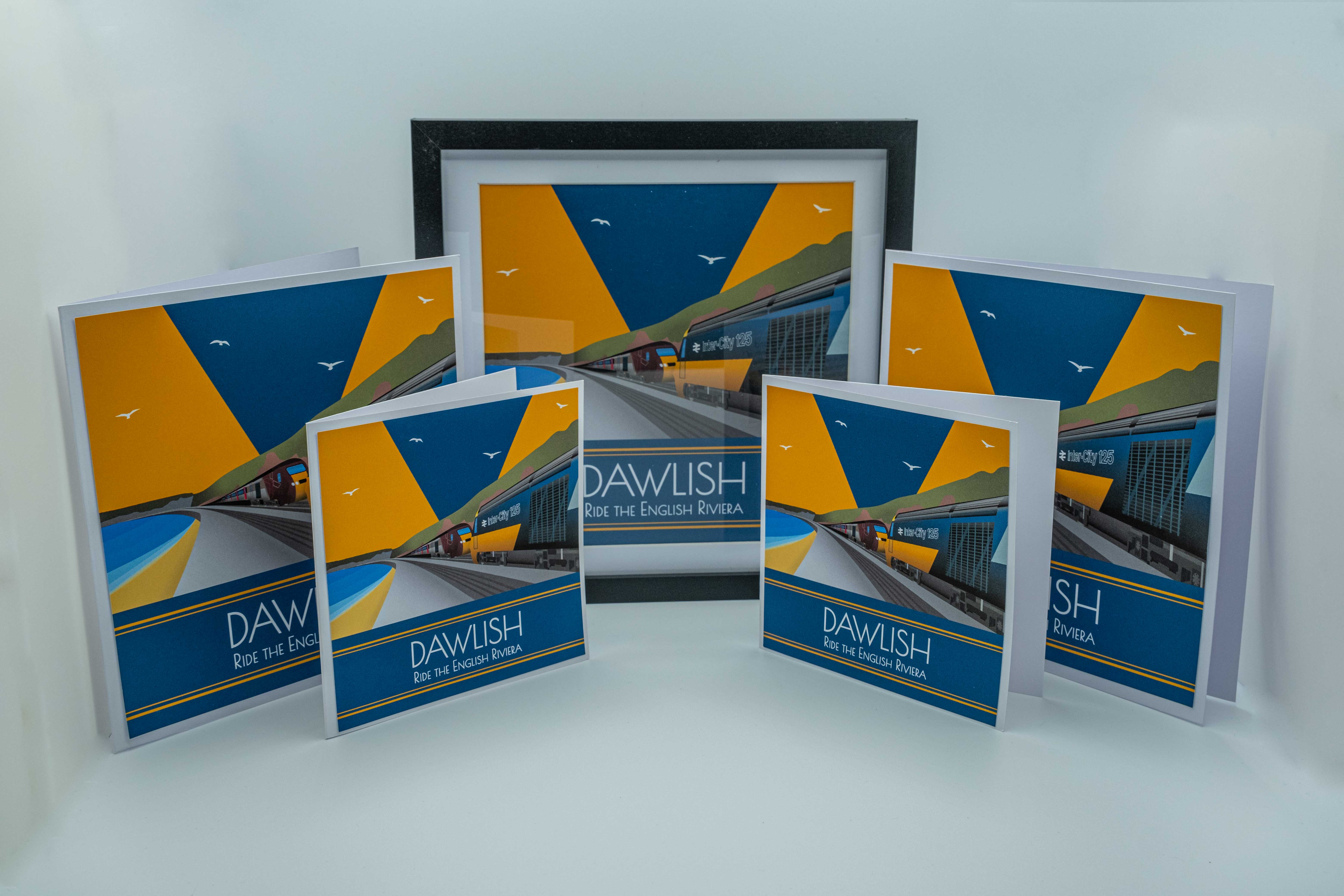
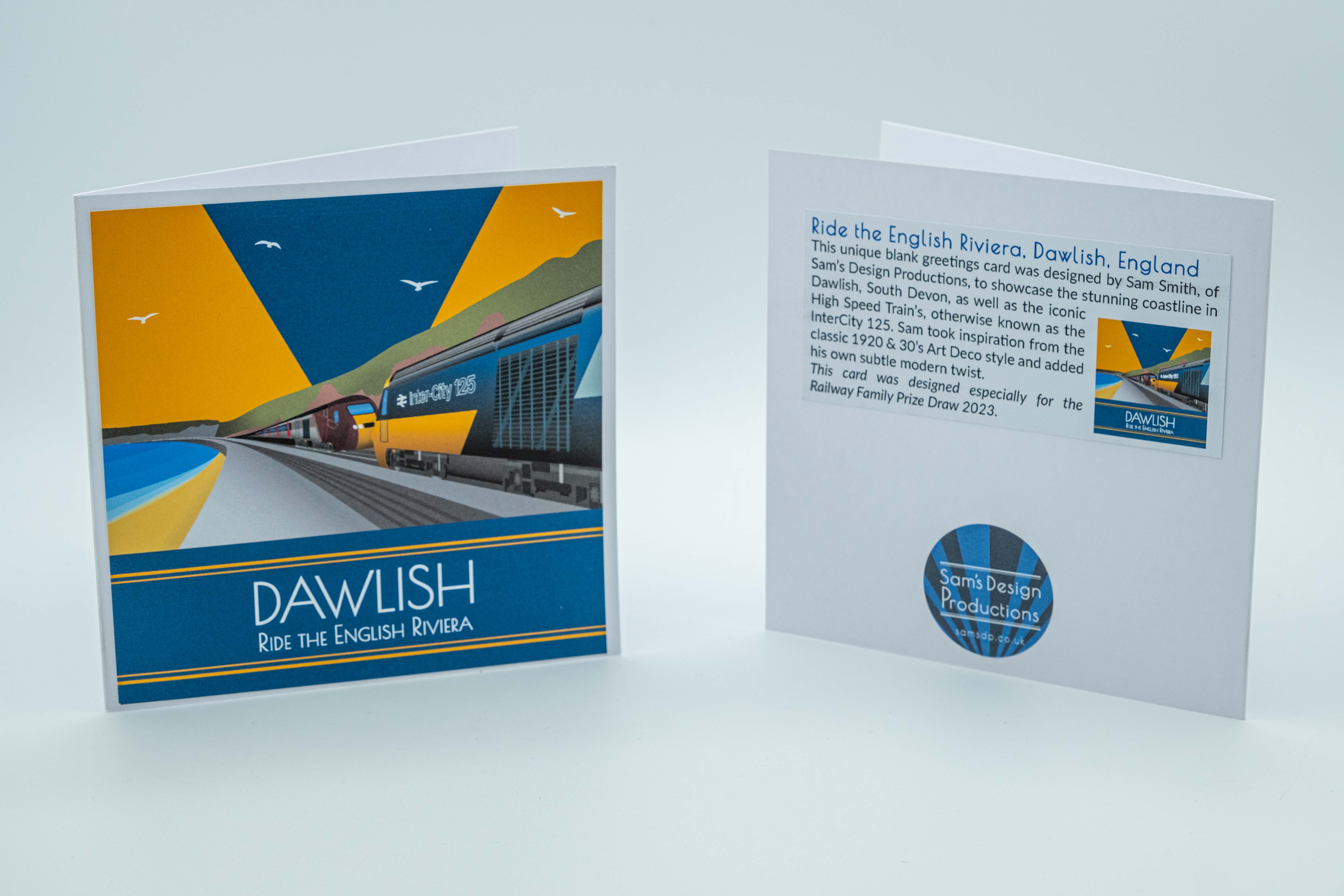
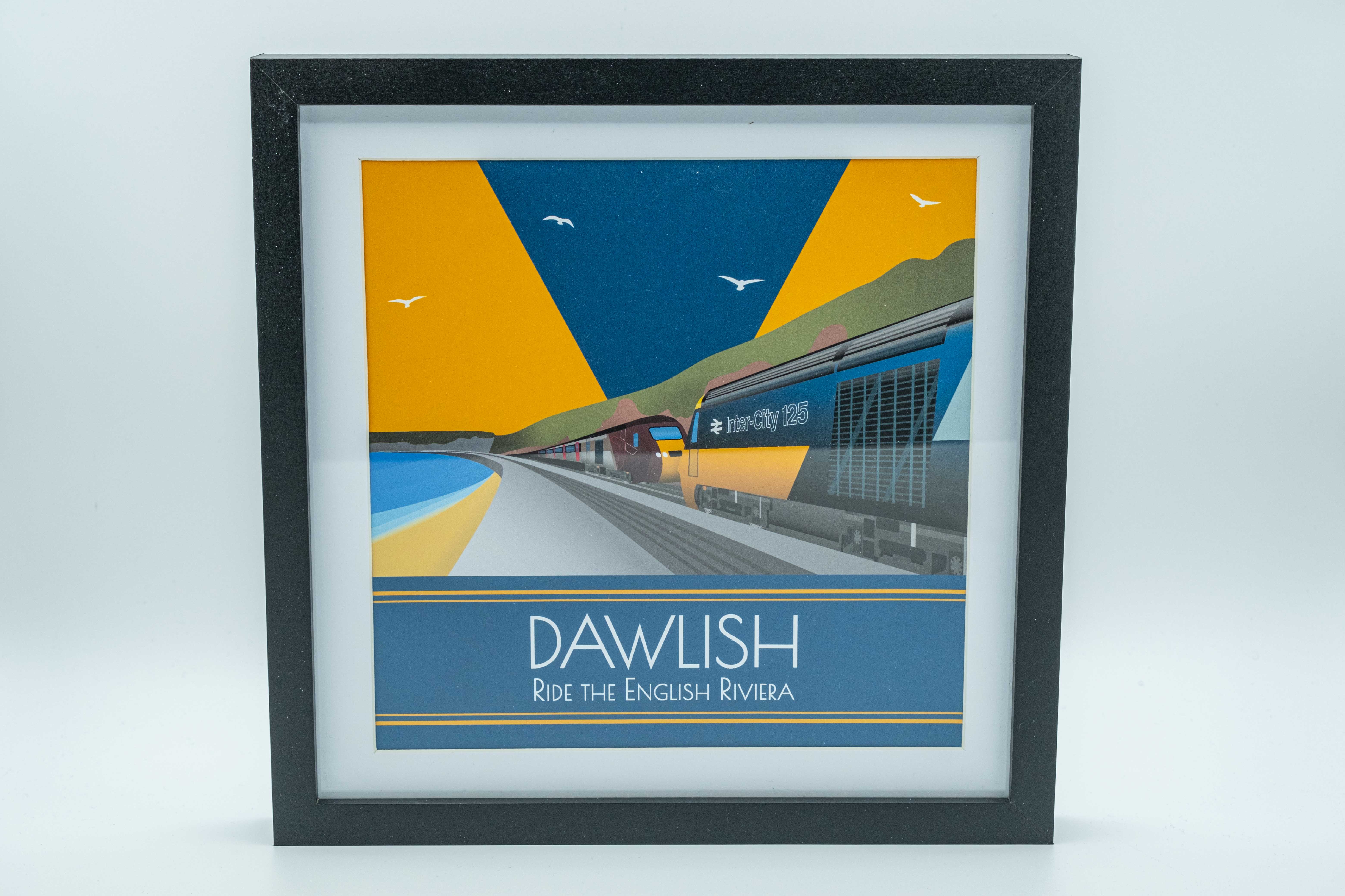
The Dawlish Design
The design idea I had was to have the location of the print be focused on the world-famous Dawlish Sea Wall; and the train depicted running along the Sea Wall would be the recently retired CrossCountry class 43 – otherwise known as the High Speed Train (HST) or InterCity 125. The CrossCountry HST trains were stood down from their daily passenger services in September 2023 after almost 50 years of operation.
As a final farewell to the class 43’s, CrossCountry repainted a selection of their HST’s into the iconic and famed InterCity 125 designs, titled the ‘celebrities’ of the fleet. So, I chose to illustrate one of the CrossCountry ‘celebrity’ InterCity 125 designs (in particular the InterCity 125 using the British Rail standard Blue & Yellow) as well as a CrossCountry HST branded in their corporate livery (using CrossCountry Marron, Silver & Pink).
After drawing the HST’s I needed to find a way to capture the iconic Dawlish scenery and Sea Wall. For the majority of my designs, I use Adobe Illustrator and this print was no exception. I decided that the best way to approach this was to use an iPad and Apple Pencil to trace over the Dawlish cliff landscape rather than trying to use a mouse and keyboard. Using an iPad lends itself very nicely to this type of work as it allows for more precision and accuracy when trying to capture the landscape. After several attempts, I settled on a landscape that represented Dawlish well.
The final aspect of the design was to create a shoreline that matched that of Dawlish. I spent many hours looking at images that showed various ways to illustrate seaside scenes in an Art Deco style. I took inspiration from many of these images & posters which I felt matched the style of my poster as a whole. It took a few attempts to get it looking ‘right’ and eventually I chose a version I was most happy with.
All that was left was to add some typography in my font of choice ‘Poiret One’ (which just so happens to be the same font I used in my Sam’s Design Productions & everythingtrains logos). I find this font to be particularly pleasing and I feel fits well with the style of my prints. The font matches and represents the print’s classic Art Deco-esque style as well as capturing my modern twist. Ever since finding this font, I have always had a bias towards using it in my design projects.
After a bit of tweaking to the font’s lettering, I had finished the first poster.

Now the poster was finished in Adobe Illustrator I needed to present the design in a format that would be appropriate for the Prize Draw. Typically, after creating Art Deco posters, I just post them on social media, and that’s the end of the project. I may then go back to them at a later date and add the design onto a card or maybe frame it as a gift; but this project was different as the basis of the designs was to produce physical products for the lucky prize winner.
So, I decided I would produce a set of greetings cards and frame the design in a pleasing square box frame. Many hours of double-sided sticky taping and cutting later I had; a set of two 6” x 6” cards, a set of two 8” x 8” cards and one 25cm x 25cm black box frame. All these products featured the aforementioned Dawlish Sea Wall Art Deco print.
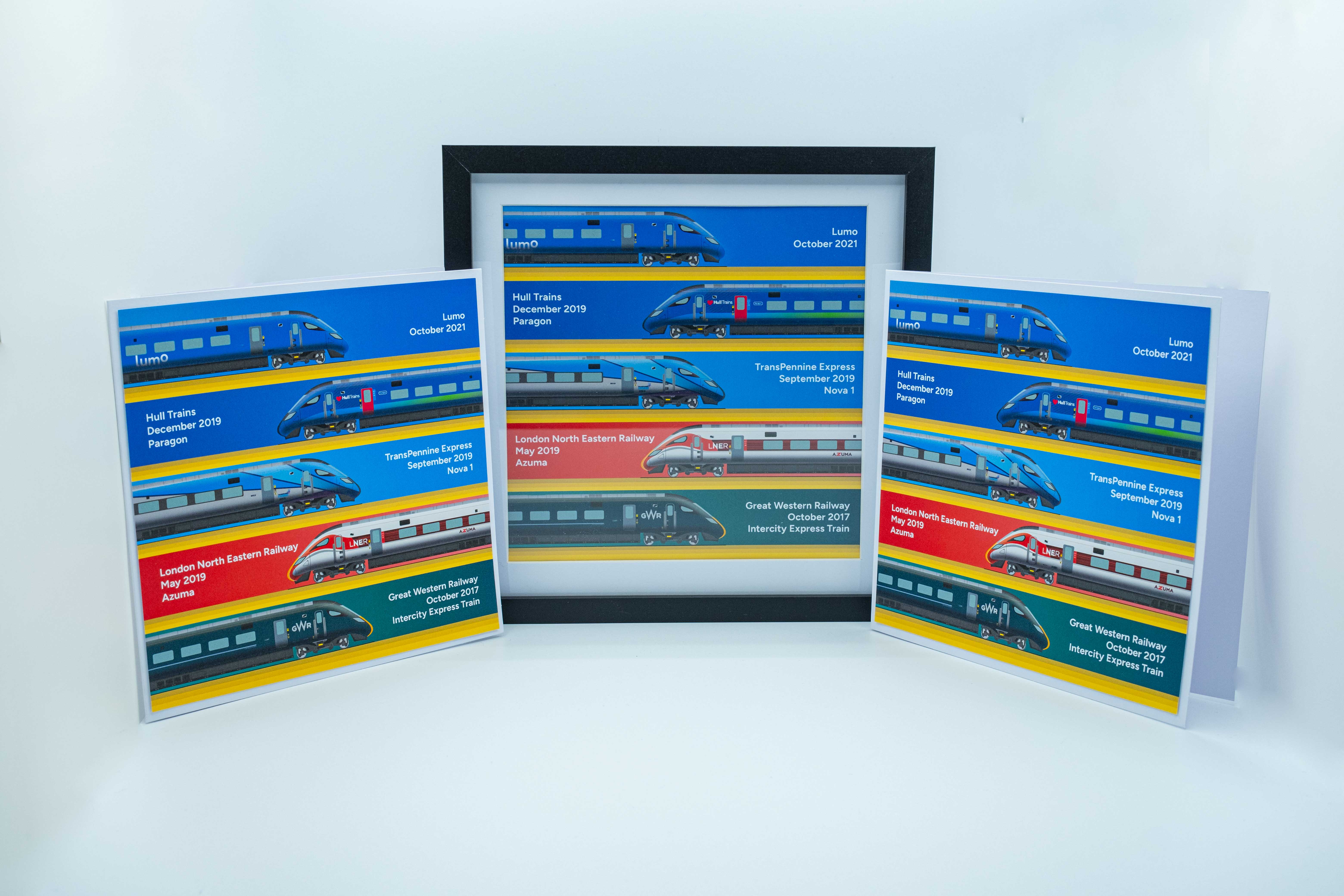
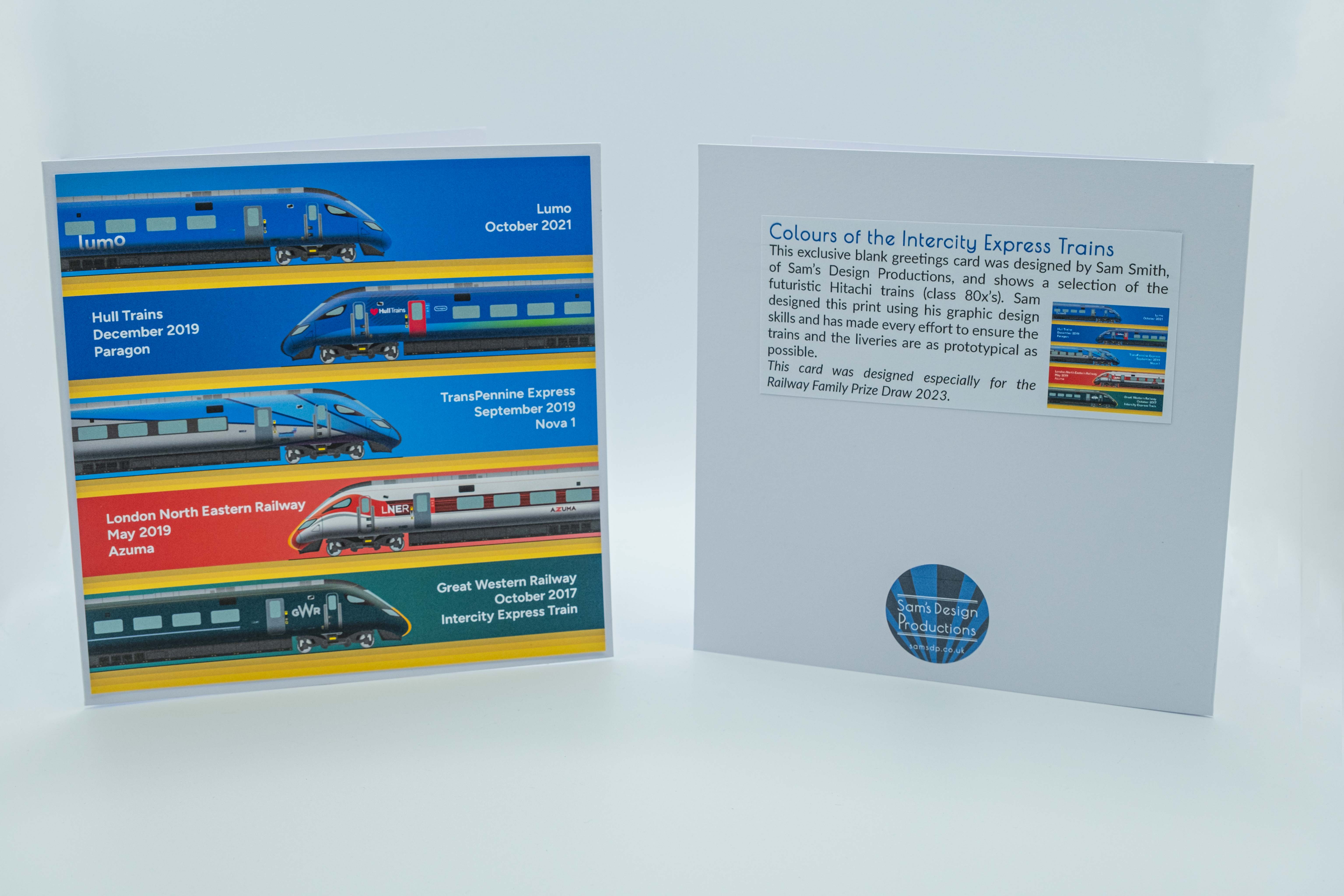
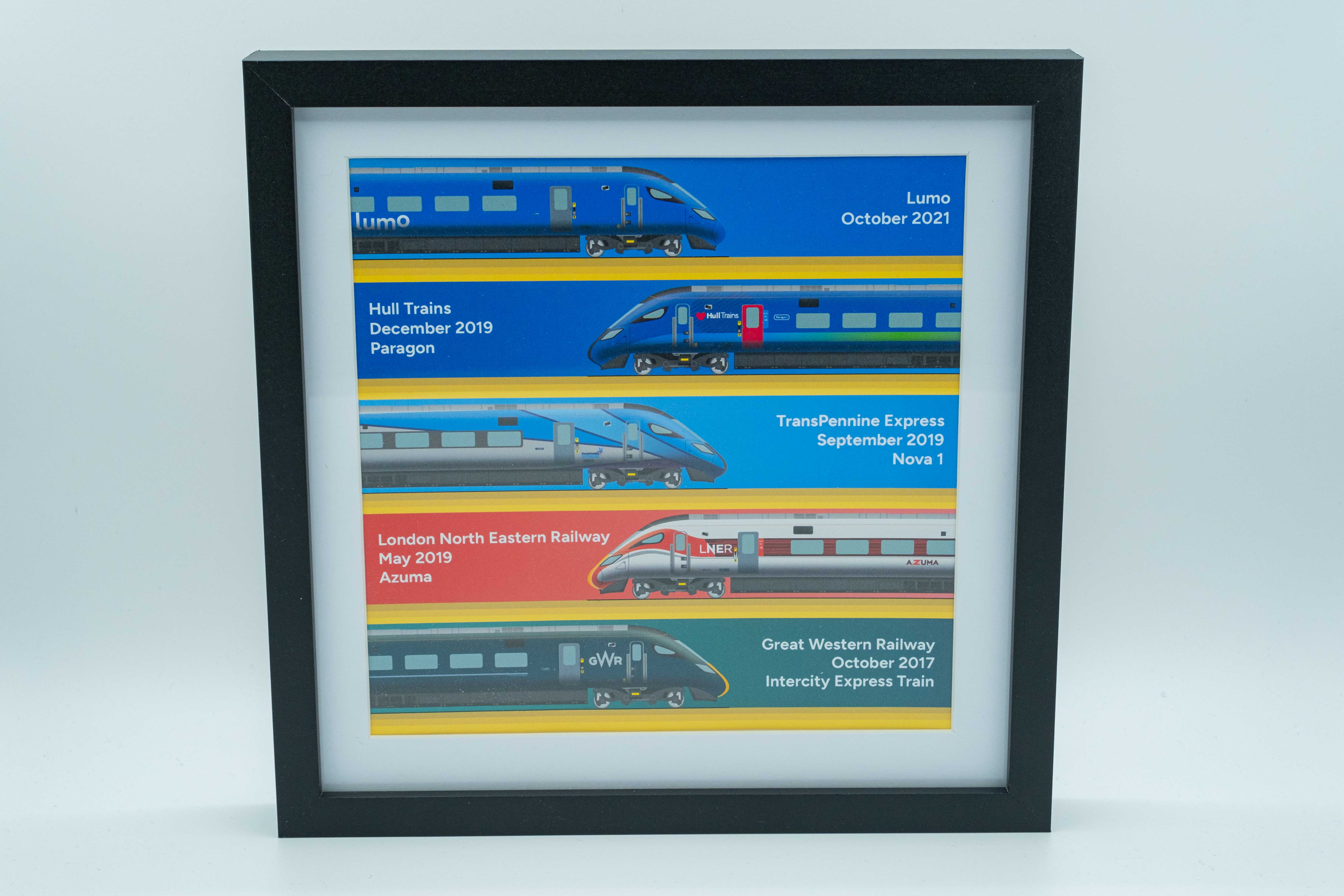
The Intercity Express Programme Trains Illustration
The next design in this series of illustrations was going to utilise one of my previously created pieces of art in Adobe Illustrator However, I was going to create something a bit different so as not to be an exact copy.
A couple of years ago I started a prototypical drawing of one of Britain’s newest Intercity trains. These trains were designed to succeed the High Speed Train’s (class 43’s) as a safer, more sustainable and greener alternative. The new Intercity trains have a party trick being that, unlike the class 43’s purely diesel engines, they are bi-mode; this means they can run on both diesel and electric (where overhead electric wires are present). To enable this there is more equipment on the train (so that provided a nice challenge to draw).
The trains were procured under the project name of the ‘Intercity Express Programme’ (IEP) and the contract to build the trains was awarded to Hitachi. However, every company that received an IEP train obviously wanted to ‘make them their own’ and one of the ways to do that was by applying a corporate design (known as a livery) to their shiny new trains. When I first created the artwork, I had only applied one of the company’s liveries and I thought I would challenge myself to depict every livery of the train that currently is in passenger service. This provided me with hours of fun trying to replicate, as closely as I could, the design on each company’s train. Some were definitely easier to do than others! I was really pleased with my replica liveries, and I think showcased the trains in all their glory.
Another way the train companies ‘made the IEP trains their own’ was to affectionally name them. The ‘nicknames’ companies gave the IEP trains all vary from; the ‘does what it says on the tin’ “Intercity Express Train” to the more imaginative “Azuma”. They are known by various names across the various operators, and I wanted to showcase that in the overall design. So, I added a little block of text next to the illustrations stating; the train company that the design related to, the nickname (if applicable), and the month and year they entered service.
Now I had finished the individual designs I brought them all onto one page and created some appealing graphics to complement the trains. Once again, I needed to turn the design into a group of physical products, so I made; a set of two 8” x 8” cards, and one 25cm x 25cm black box frame which featured the design.
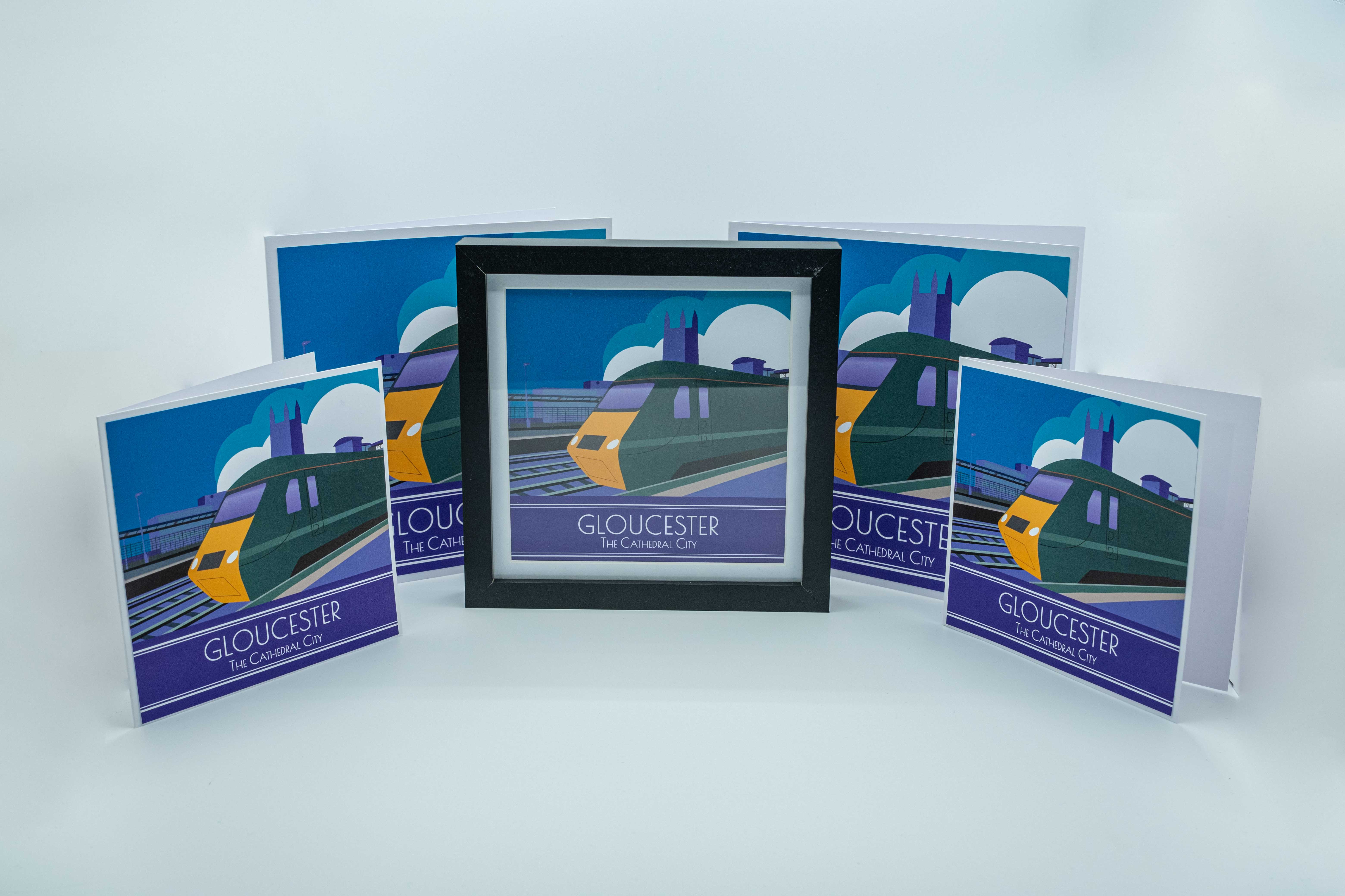
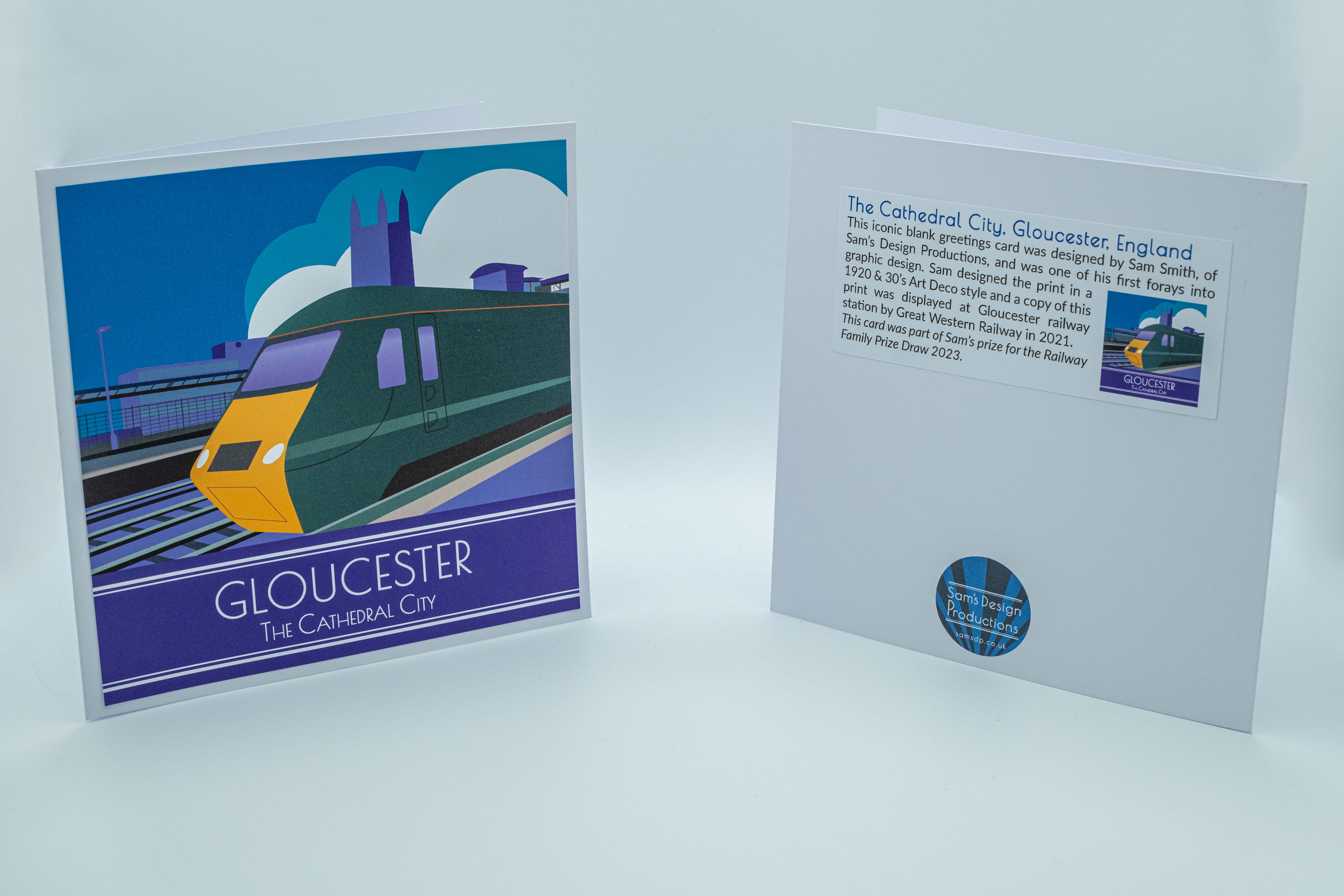
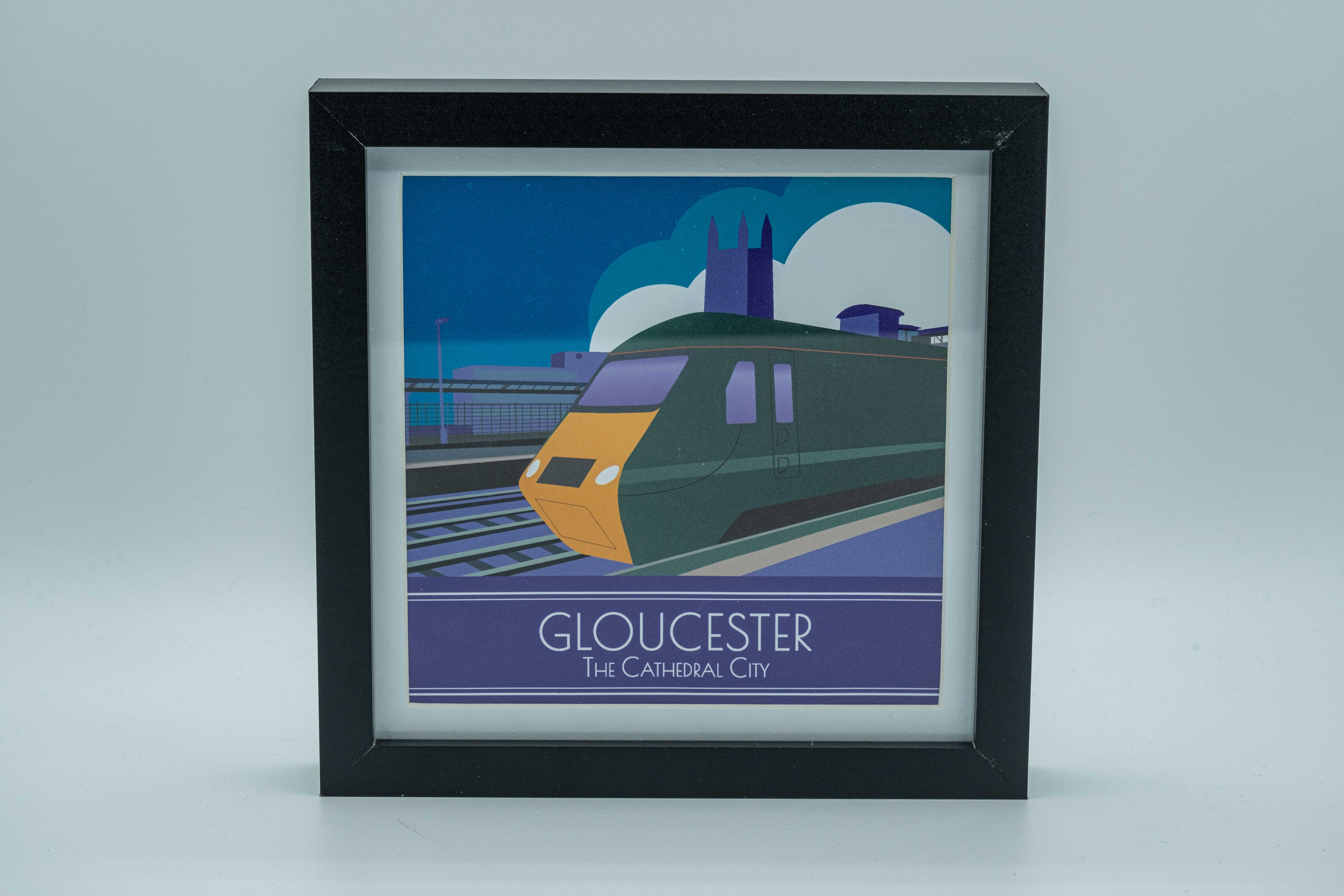
The Gloucester Poster
The final design to join the pair of other illustrations and create a trio was my first ever Art Deco-style poster I created way back in 2021 of Gloucester Station. This poster started my graphic design journey and showed me how effective this style of poster could be. I learned an awful lot during the process of designing the Gloucester poster, specifically teaching myself about techniques, colour theory, perspective, etc.
This design was created after Nigel Harris, from the “RAIL” magazine, posted on Twitter (X) to see if anyone could create an Art Deco train design similar to an Art Deco design, they had linked to below the Tweet. Someone tagged me in the post, and I took this opportunity to have a go at designing something.
This poster was also published and displayed at Gloucester Railway Station, thanks to a very kind employee at Great Western Railway. So, this poster felt like a fitting piece to include in the prize bundle. Granted, there are several elements of the design that I would do differently today, but I wanted to keep the poster in its true form for the prize.
Once again, I needed to create a set of physical products, so I decided to create; another set of two 8” x 8” cards, two 6” x 6” cards, and an 18cm x 18cm box frame. One small challenge that arose was that the original Gloucester Station poster was in a portrait orientation, and I needed it in a square ratio. So, I had to make a few small amendments and adjustments to allow the print to be used in the format I need it in. Luckily it was pretty straightforward!
Summary
So, I now had a trio of designs and accompanying products that I could include in the prize bundle. After a bit of careful and elegant packaging, it was all ready to be shipped to the winner of the prize from the Railway Family Prize Draw campaign.
I had great fun designing and producing the prize and it was great to know that they would hopefully provide someone else with some enjoyment.
I always love supporting the Railway Family Prize Draw and this year was no exception. Thank you to Heather, Mike and the team for trusting me with the logo design and prize bundle. It’s brilliant to be supporting such a worthy charity year after year. Here’s to next year!
Leave a Reply